Today we launch the first few key ring cards in a new style!
They are exactly the same size and construction as the stripey cards we've been producing for years, but instead of bright and stripey, they are pastel and plain.
Why? Because some of our followers have been telling us that they love our work, but find the colours on the cards too bright.
So we mulled it over for more than a year, got inspiration a few months ago, got feedback on social media, finalised it a week ago....
....And they arrived today!

As stripey-border stock of cards gets low-ish we will be reprinting in plain-border. With over 150 card designs, it is likely to be months before we have the full range in the plain-border style. We will stock both border styles alongside each other. So when you chose a card that is available in plain, you will be asked to select stripey or plain.

We decided to use 4 colours on the new cards.


They are exactly the same size and construction as the stripey cards we've been producing for years, but instead of bright and stripey, they are pastel and plain.
Why? Because some of our followers have been telling us that they love our work, but find the colours on the cards too bright.
So we mulled it over for more than a year, got inspiration a few months ago, got feedback on social media, finalised it a week ago....
....And they arrived today!

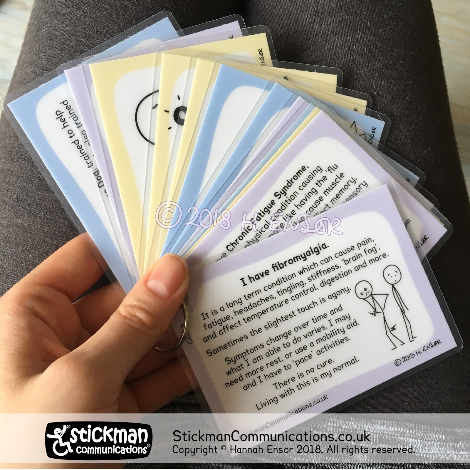
We decided to use 4 colours on the new cards.
- Lilac: Cards explaining a specific conditions.
- Pale blue: Cards giving general information about symptoms or needs.
- Pale turquoise: Cards that can be summarised as 'here and now, I am OK.'
- Pale orange: Cards that can be summarised as 'here and now, I am not OK.'
Some cards don't easily fit into a category, in which case we will do our best to allocate them a sensible colour.
We currently have 12 designs in this new style, and expect to print new ones every month or so.

You can find all the cards available so far in this new style here.
While our range of cards in this new style is very limited, we've added a new page to our website where we'll put all the cards available in this style in one place (as well as being able to select either stripey or plain border on the main product page).


Comments
Post a Comment
Feel free to comment, but please note that any offensive or inappropriate comments - including advertising - will be moderated.